
Brand Dr. Loretta
Category skincare, e-commerce
Improving a key e-commerce landing page
Challenge
The Dr. Loretta team was struggling with how to lift their brand voice and increase conversions on their main landing page directed from social ads. A big website relaunch was just months away, so any high-budget transformations were out of the question.
The “All Products” page lacked warmth, brand messaging to educate consumers, and key call-outs to value products and categories. I identified a short-term solution that included small but impactful fixes to refresh the user experience.
Role
Audit to identify UX issues + what copy or CTAs needed updating
Research to identify best practices, common microcopy and layouts users expect in the beauty space
UX writing and copywriting
Wireframing and mockups
Collaboration with developer to ensure landing page was redesigned with current user research and best practices
Tools
Hotjar - to see lost user drop off in the flow with heatmaps and recordings
Google Analytics - to compare site activity pre- and post-launch
Adobe XD - for wireframes and mockups, and to present content edits
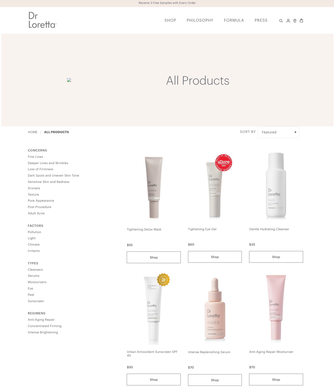
Here’s the original experience
Solutions
Swap simple white backdrop imagery for lifestyle product photography to boost engagement.
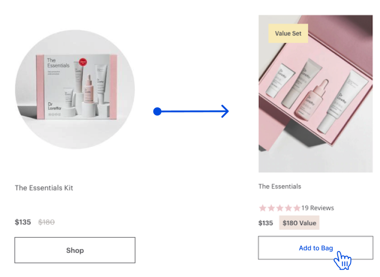
Simplify conversions by changing “Shop” to “Add to Bag” — so if you’re ready to buy now, you can simply push your favorites to your bag instead of needing to go to the product detail page first. Product images and titles would still link to the detail page.

Use “Value Set” and dollar value badges to indicate savings for specific sets. Many of the value skincare sets were not pulling much revenue despite savings. This was an opportunity to see if this would boost sales.
If we had the opportunity, I would have done an A/B test to see if indicating total value, or total savings would result in more sales.

Add shoppable category banners through the shopping experience to drive traffic to top revenue-driving pages. These categories were identified as top revenue builders for the brand using Shopify and Google Analytics and in early designs made the experience feel more interactive and immersive with lifestyle imagery.

Add a new header and footer including valuable brand messaging and positioning for new users coming to the site for the first time from paid media.
Consolidate all products to one page versus the previous two, which had only a few products visible on each, to give easier access to all products.
Results
I was able to design clearer CTA buttons, brand messaging, and a more engaging experience that increased time on page by 30% and increased conversions. Hotjar also validated interest in brand copy and value messaging as we saw users spend time hovering and reading.
We also saw an increase in click-through to value-bundle products with new microcopy changes. Google Analytics and Hotjar recordings indicated an increase in click-throughs and interest in shoppable category banners, keeping users on-site longer.
A glimpse at the mockups
